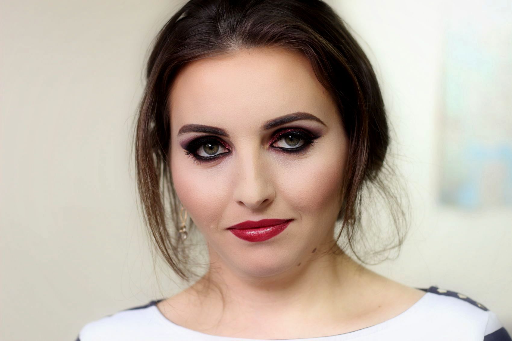
Марияна Стоянова
Графичен дизайнер
За мен
Аз съм Марияна Стоянова и помагам на бизнеси да изградят своите марки чрез професионален дизайн на лого и бранд идентичност. По този начин те развиват идеите си и се открояват с професионализъм, иновативност и креативност сред конкурентите. Дизайните ми са свежи, модерни и елегантни.
Може да ми се доверите за следните услуги: • Дизайн на лого • Бранд идентичност • Корпоративна идентичност • Brand guide на марката • Дизайн на печатни материали – визитки, плакати, брошури, списания • Дизайн и предпечат на книги и корици • Дизайн за социалните медии • Ретуш на снимка и много други.
Непрекъснато се развивам и придобивам нови знания и умения, за да постигна най-добри резултати.
Експертиза и умения
Моето портфолио
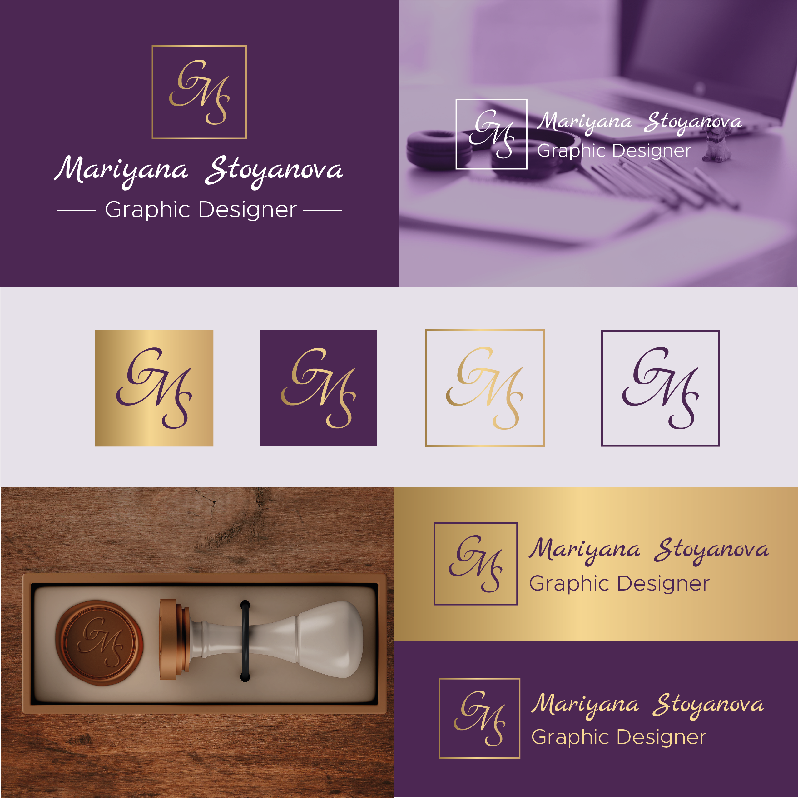
PERSONAL LOGO AND BRAND IDENTITY
This is a design for a personal logo and brand vision. The logo is an elegant blend of the initials of my name - MGS. This elegant logo design shows the personal character - calm, loving nature, the beauty of art, books and music. The color combination is royal purple and gold - they show the elegance and style of the design in which it is created. The purple color carries strong energy, is a symbol of growth, originality, dreaminess and unconventional thinking. The gold element is associated with elegance, but also with the sun, warmth, the divine, with something that renews and blooms. The whole combination of the color scheme, graphic elements, elegant logo design and typography selection shows the design style that the creator creates, and the style of work that he has - elegant, stylish, simple and with extreme attention to detail.
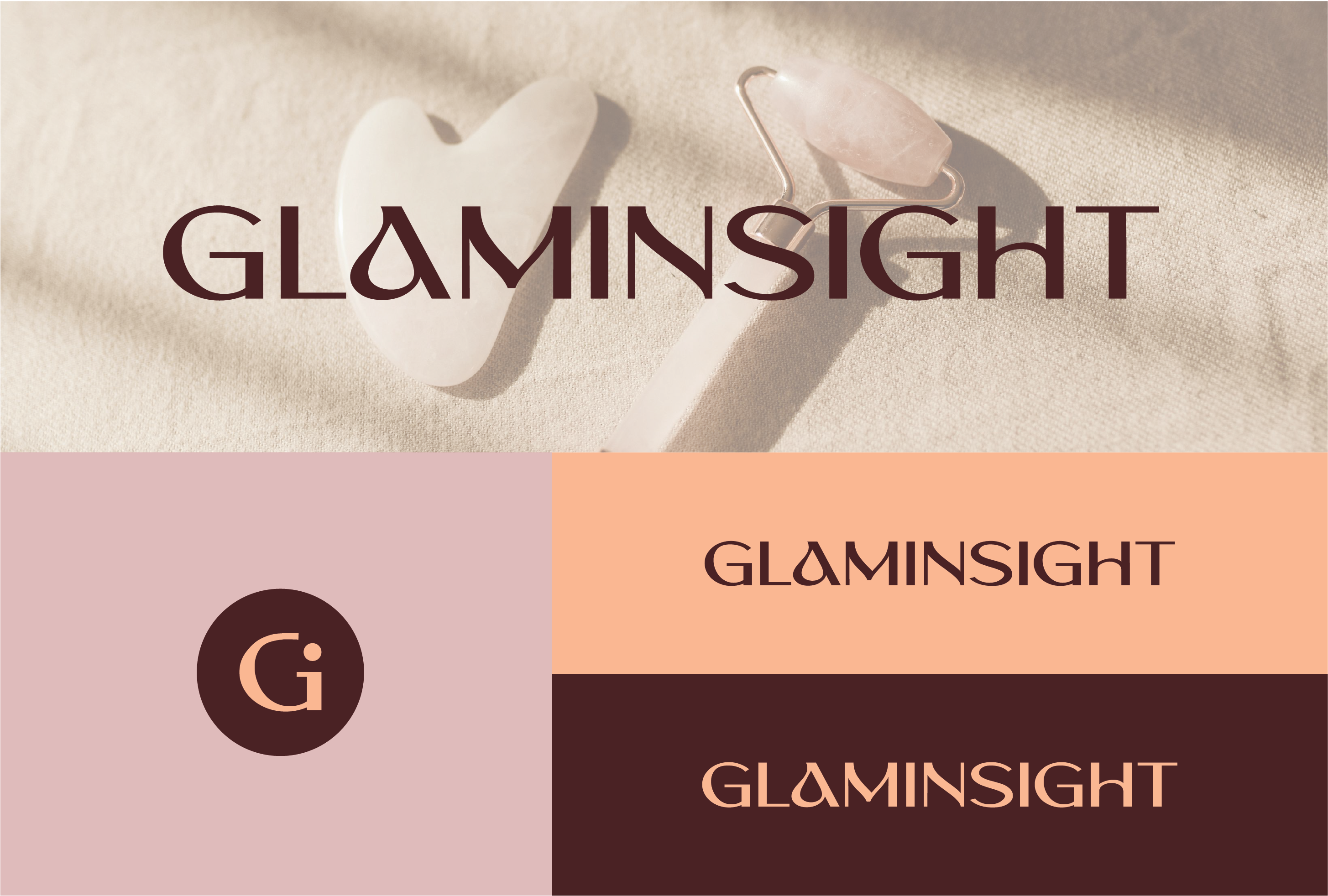
LOGO and BRAND IDENTITY - GLAMINSIGHT
The goal of the project - to create a logo for an online platform focused on the beauty industry and writing content on this topic. Requirement - the logo must represent the spelling of the name in a certain style, which should be simple, clean, but with a characteristic and unique handwriting. Design solution - The logo design was created for use only in a web environment, as it is intended for the development of an online media for beauty news. The logo represents the spelling of the brand name in a modern way, different from other competitors. The font has slight curves that add character and uniqueness. The spelling of the letter A, which looks like a flowing drop, is specific. The color palette is soft, gentle, warm, modern and completely in the style of the beauty industry. The overall look of the design is elegant, stylish and exudes sophistication. This project was developed in collaboration with the digital marketing agency Interval.
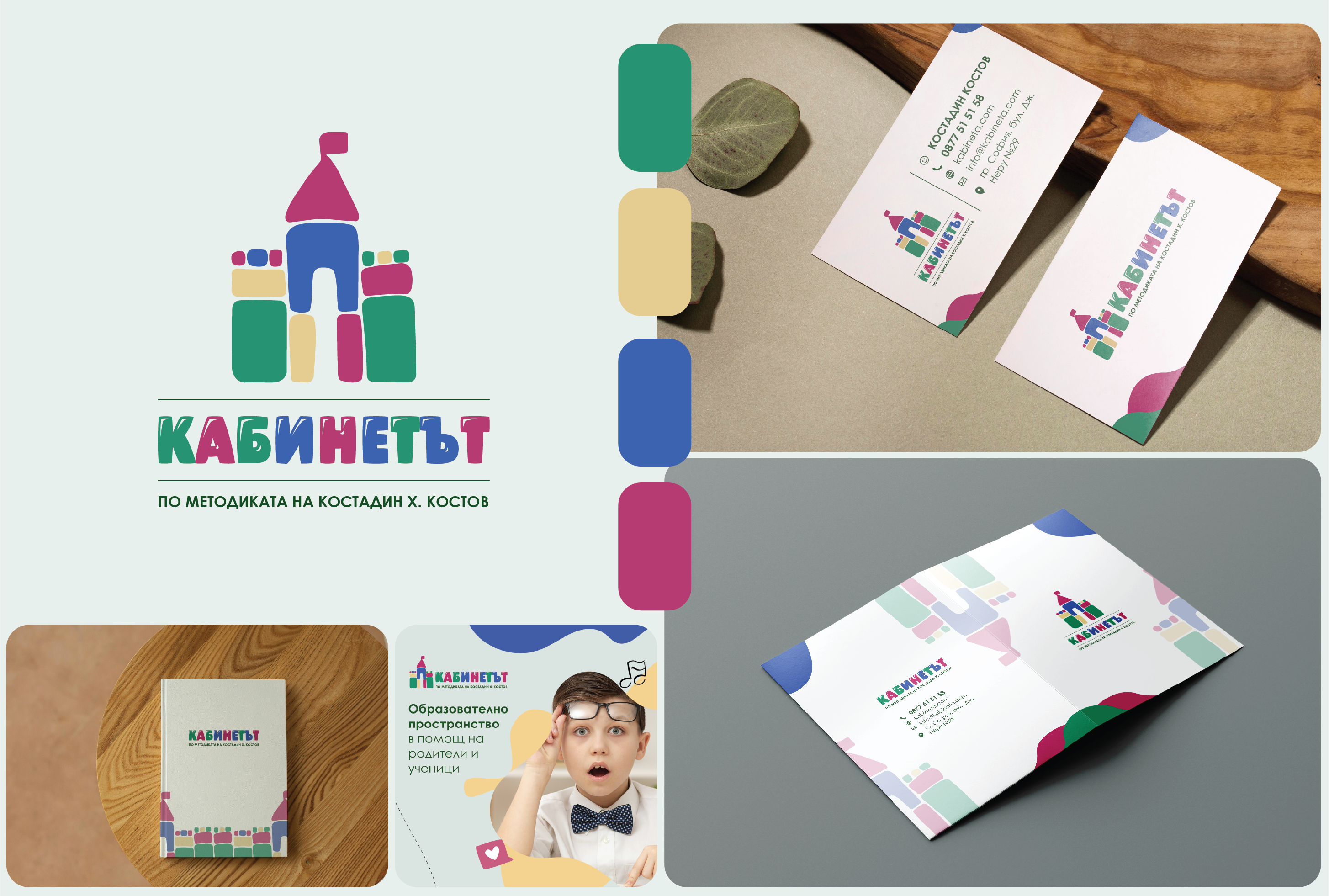
Logo design and corporate identity - KABINETA.COM
The office - Кабинетът, is an educational space to help parents and students. The methodology and approach to learning are individually created, and students of different ages can receive assistance with the learning material. The goal of the project - to create a logo that resembles a castle and suggests that the student is in the teacher's office, where the learning process takes place. The logo had to have a suitable part for both young children and young people, since classes are held for adolescents of different ages. Creative design solution - a colorful and fun logo, suitable for the age audience. The colors are fully consistent with the interior of the room. The castle resembles a child's drawing of an inflatable castle or a castle from fairy tales, as this is the part that attracts the attention of younger children. The logo without this graphic element can be used independently and is suitable for older children and adolescents. The writing of the letters is also slightly playful and friendly. In addition, I was also tasked with creating a design and corporate identity with the following elements - a double-sided business card, a folder, an A4 notebook, an A5 notebook, a pen, and a design for social media. All elements correspond to the brand identity, so that it can be complete and recognizable.
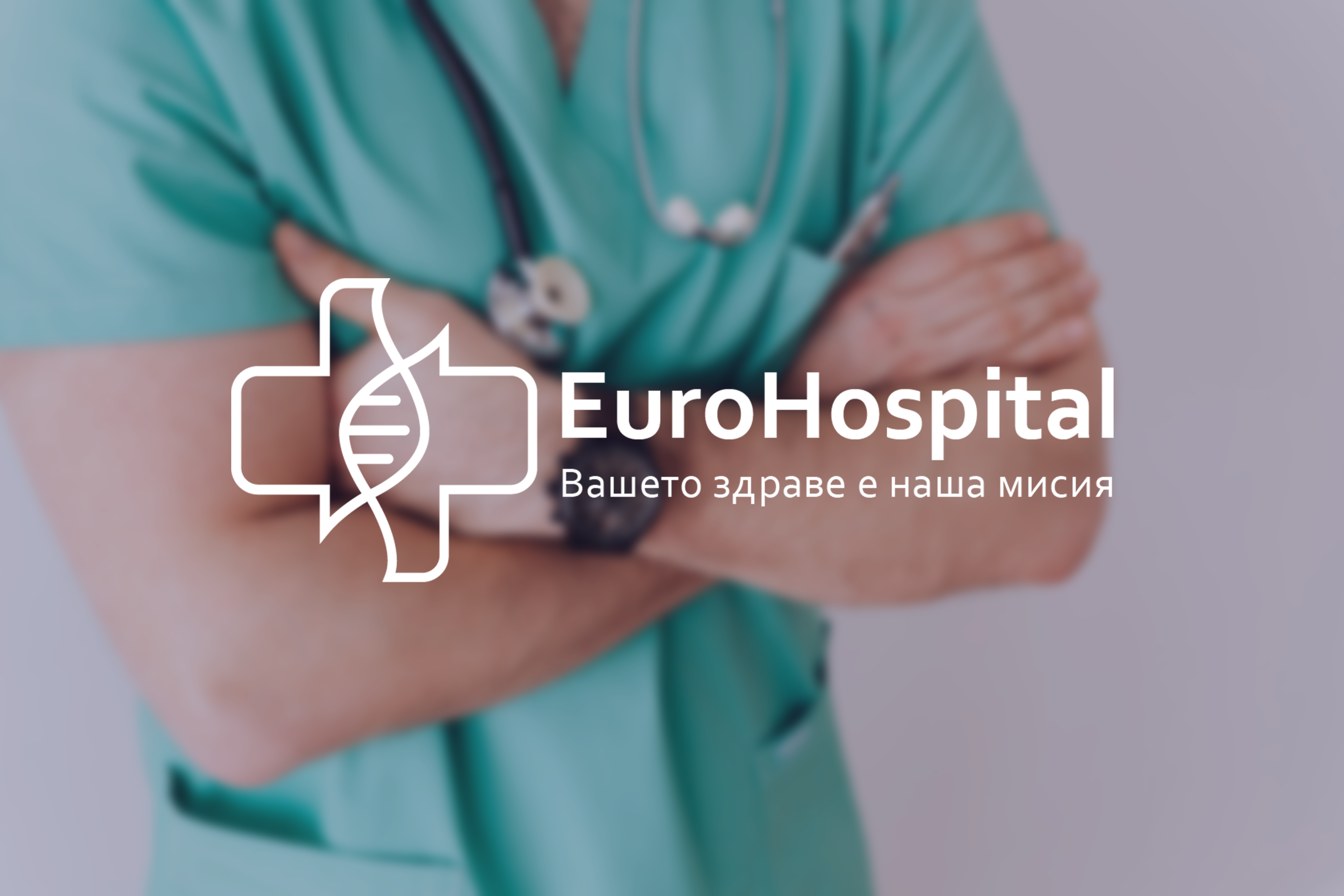
LOGO AND BRAND IDENTITY - EUROHOSPITAL
The goal of the project was to create a redesign of the logo and brand identity and to modernize the look and overall vision. The new logo is modern, minimalist and fully connected to the idea of the hospital. It is a combination of the following elements - a medical cross, a medical stethoscope and a DNA molecule. Its overall look is soft and aims to reduce tension and stress. Each element of the logo can be used as an independent part - the graphic element and the text part. The graphic element can also be used as a favicon. The selected font and colors are consistent with the overall feeling of calm and trust. The elements that I developed for the brand identity are the following: logo, typography, color palette, business card, company letterhead, signature, branding, brand book. This project was developed in collaboration with the digital marketing agency Interval.
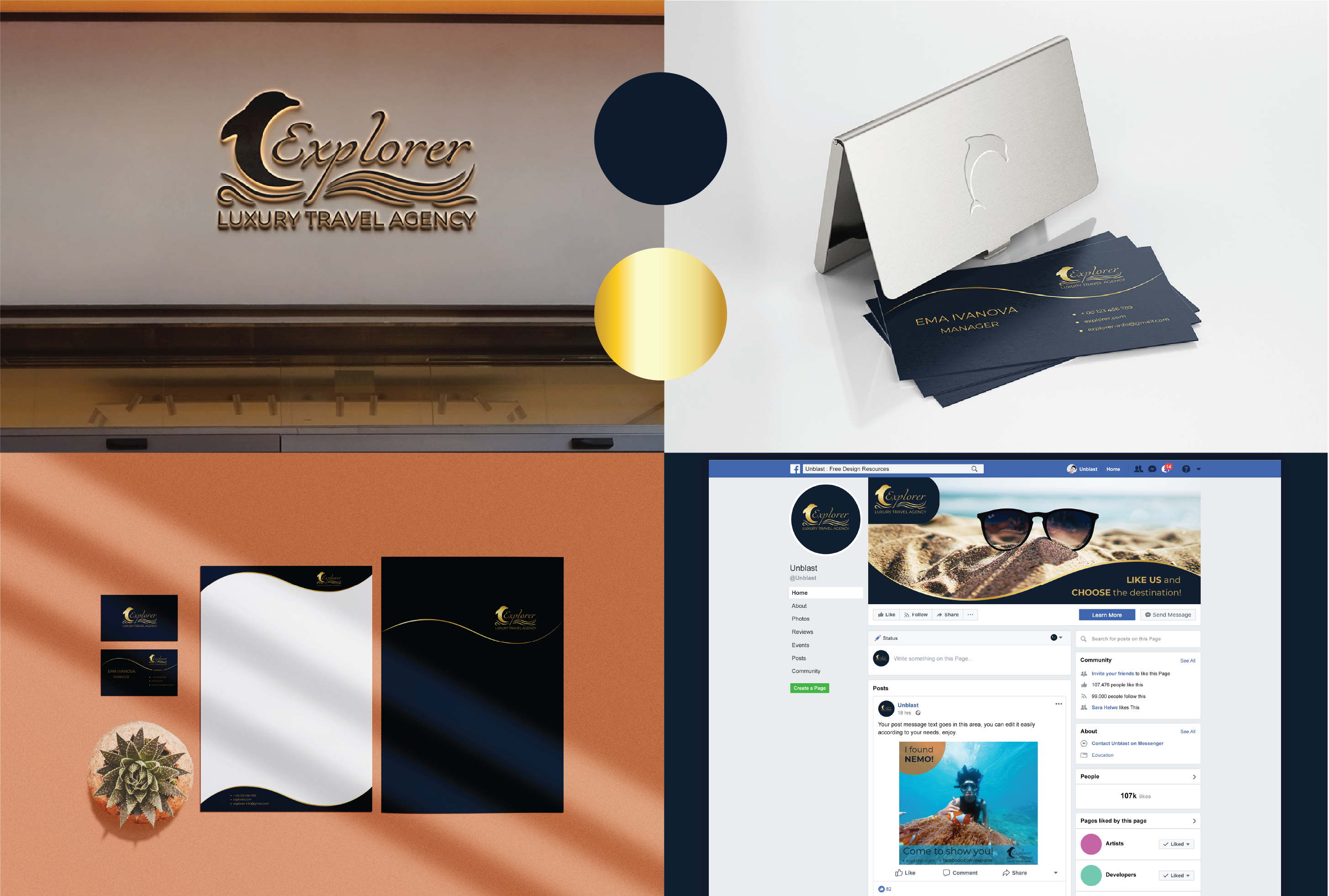
LOGO and BRAND IDENTITY of Luxury Travel Agency
LOGO and BRAND IDENTITY of Luxury Travel Agency - Explorer. This is my academic project. The entire design of the logo and brand identity is entirely my idea and development. I used freely available resources such as images, mockups and clips for the commercial. The idea of the brand is to create a suggestion of luxury, freedom and elegance, which are part of the travel agency's mission. DESIGN - elegant, stylish and simple. COLORS - gold and dark blue. The whole design suggests luxury, something expensive and elegant. Included elements in the BRAND IDENTITY: LOGO design; Corporate identity - business card, letterhead, folder, envelope, pen and others; Brochure; Billboard; Promotional materials; Social media advertising; Vehicle branding; Vision of a working team; Product packaging and souvenirs; Advertising video. I worked with this programs: Adobe Illustrator, Adobe Photoshop, Adobe InDesign, Adobe After Effects.
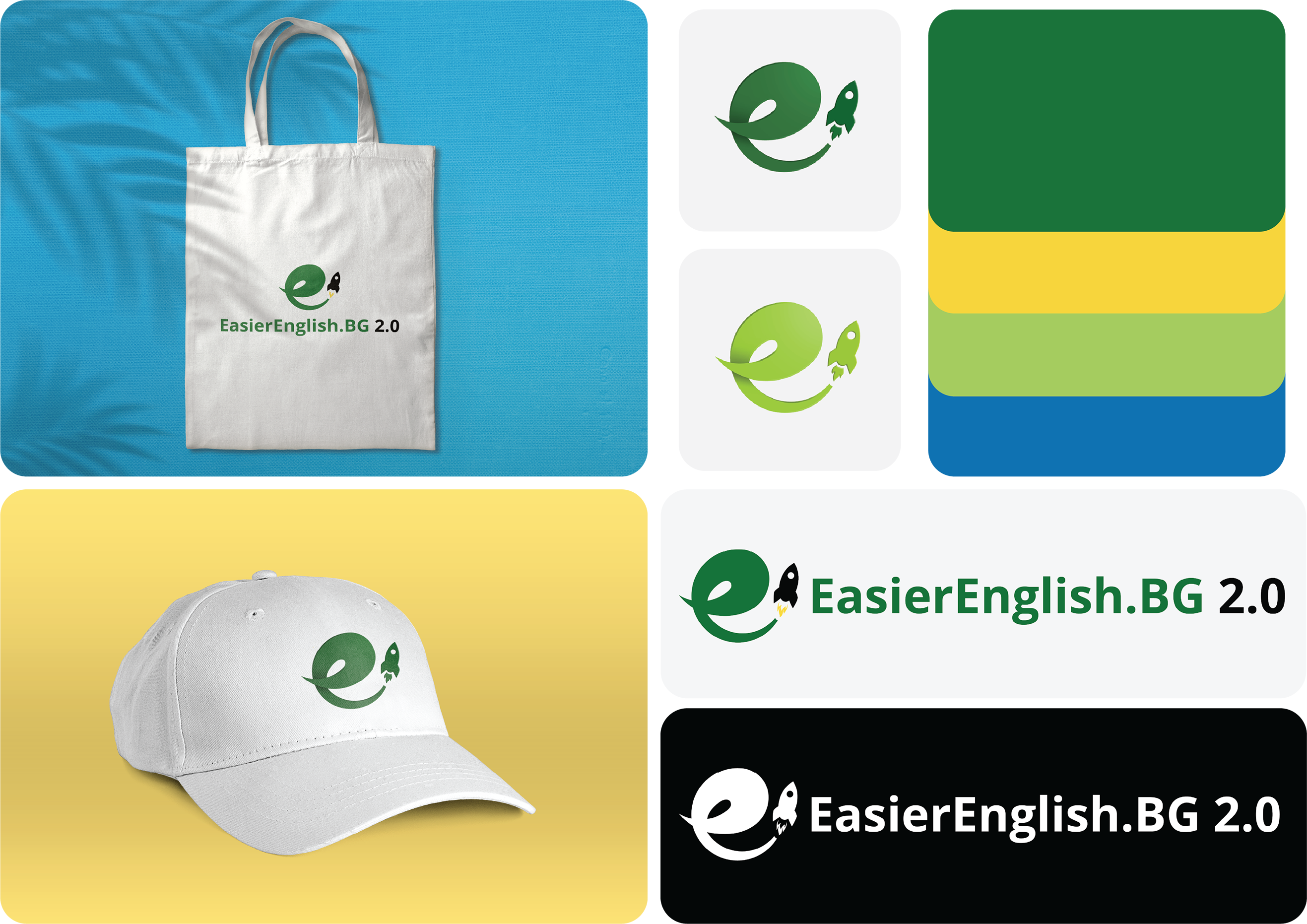
Logo redesign and brand identity refresh
EasierEnglish.BG is a space where anyone who knows Bulgarian can access English lessons and grammar, completely free of charge, which are designed for beginners and intermediate-advanced learners. My role in the project was to do a slight redesign of the logo, as well as to propose a new, more colorful and fresh color palette, consistent with the brand.
Продължителност
1 седмица
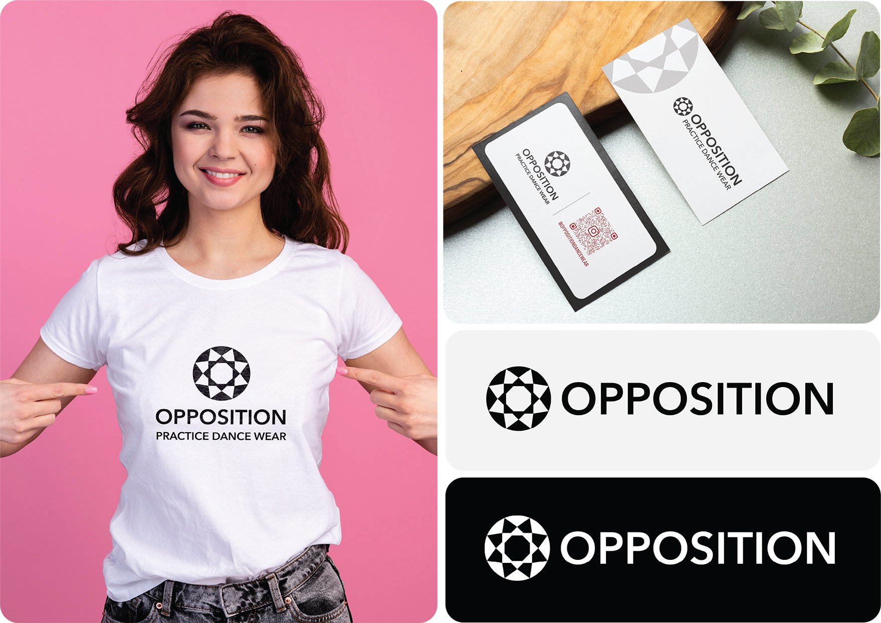
Logo design - Opposition
The brand is for practice dance wear. The logo is a combination of a symbol and the brand name. The symbol represents a beautiful flower, but also a mandala. Them together suggest the beauty and symmetry that is observed in modern dance. The colors of the brand are black, white and burgundy. The logo is made in black and white.
Продължителност
1 седмица
Опит
Graphic Designer
Фрийлансър • Фрийланс
2021 - До момента
Работя като графичен дизайнер на свободна практика на българския и международния пазар. Специалист съм в професионален дизайн на лого, дизайн на бранд идентичност и корпоративна идентичност, дизайн за социални медии, печатен дизайн - визитки, папки, бланки, брошури, списания, етикети, опаковки. Обработвам снимки и изображения. Имам клиенти от различни бизнес индустрии - образователната, строго корпоративната, бюти индустрията, развлекателната и много други. Изграждам ярки визии, които са съобразени с ценностите, визията и мисията на бранда, за да се отличи сред конкурентите си. Освен това се интересувам от изкуство, ръчно и дигитлно рисуване и скициране, фотография, типография и калиграфия. Работя със следните програми: Adobe Illustrator, Adobe Photoshop и Adobe InDesign, Adobe After Effect, SketchBook, Climpchamp, Canva.
Образование
Design Academy
Postgraduate Degree • Graphic Design
Завършване: December 2021
University of Economics - Varna
Master's degree • Banking, Corporate, Finance, and Securities Law
Завършване: June 2011
University of Economics - Varna
Bachelor's degree • Marketing
Завършване: 2009
Сертификати
Graphic design for feelancers
Design Academy, серт от МОН • Издаден: 2021
INTRODUCTION TO DIGITAL PAINTING WITH TABLET
Design Academy, серт от МОН • Издаден: 2023